Hi all,
Another suggetion:
The font used ‘Avenir Next’ while a classic font (and one of my all time favourites) I’d like to question why this is the font being used?
It is quite an extended font, which on narrow screens takes up valuable screen real estate.
Why not use something more condensed? Even Roboto would be a better choice in this regard.
Inter is very versatile, and it is open source: https://rsms.me/inter/.
I think this would be a better choice.
The font currently used in Runbox 7 was chosen mainly due to legibility on computer screens, as an alternative to the classic Verdana font face which is also quite rounded.
There might however be better options for smartphone screens, partly for the reason you mention, so we might be changing this in the future. We are also planning to introduce theming, which would allow users to choose and customize the interface.
I don’t want to sound like I’m harping on about the font choice, but Avenir was designed back in the 1980s when screen use was not a priority. So I really do wonder about this font choice.
You said that it was chosen due to legibility on computer screens however I would respectfully disagree with this. Like I said, It does take up a lot of horizontal space, even on a 14" and 15" laptop screen.
I have no doubt it is an excellent font, however in this case I think it needs to be seriously re-considered from a user experience point-of-view.
So theme/font options I think would be an excellent addition to an already excellent product.
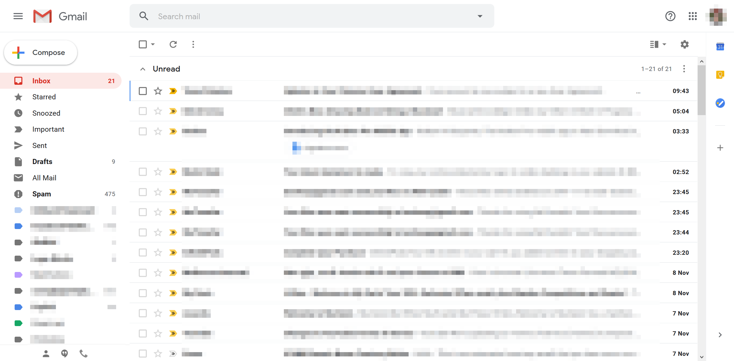
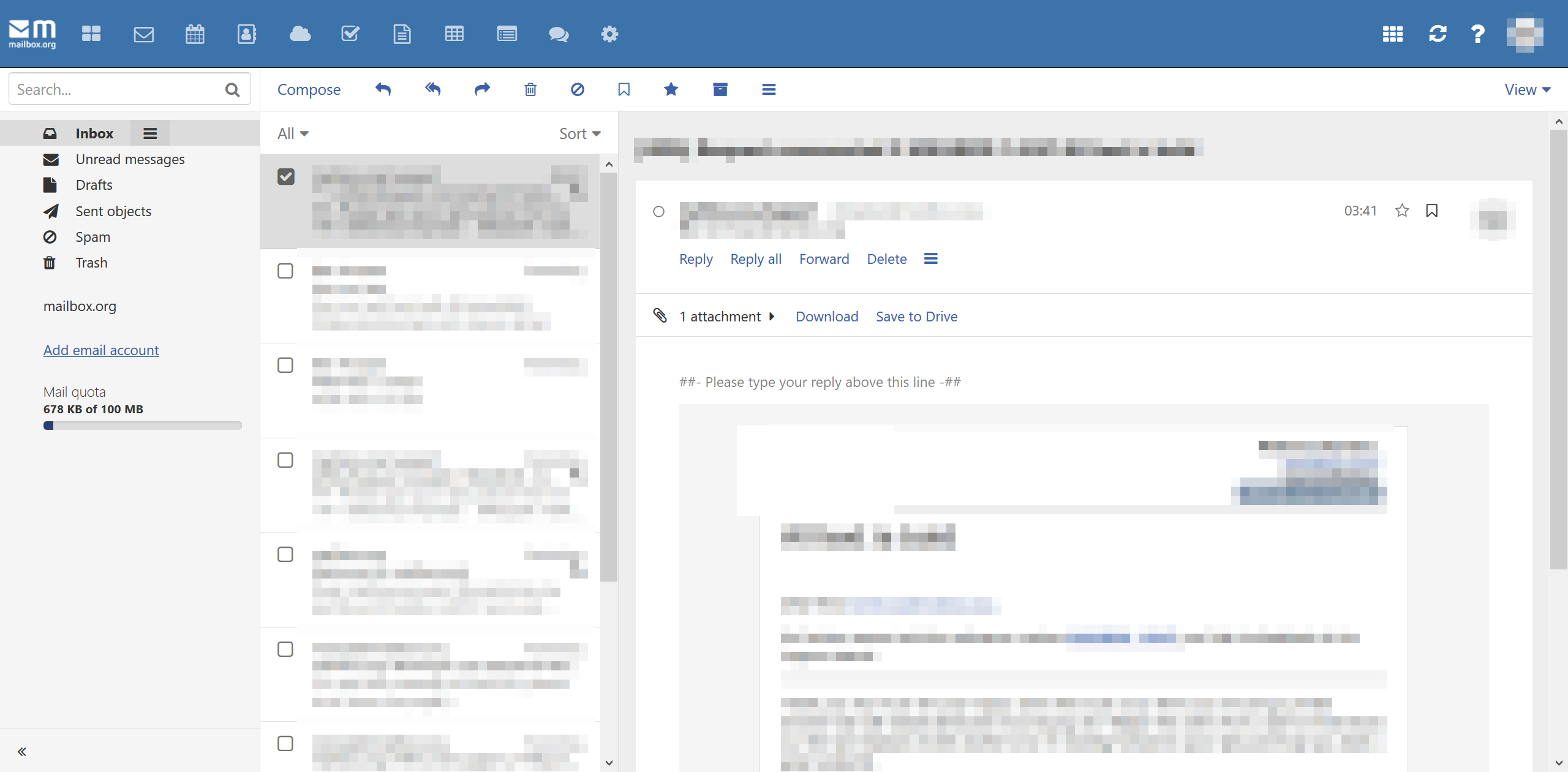
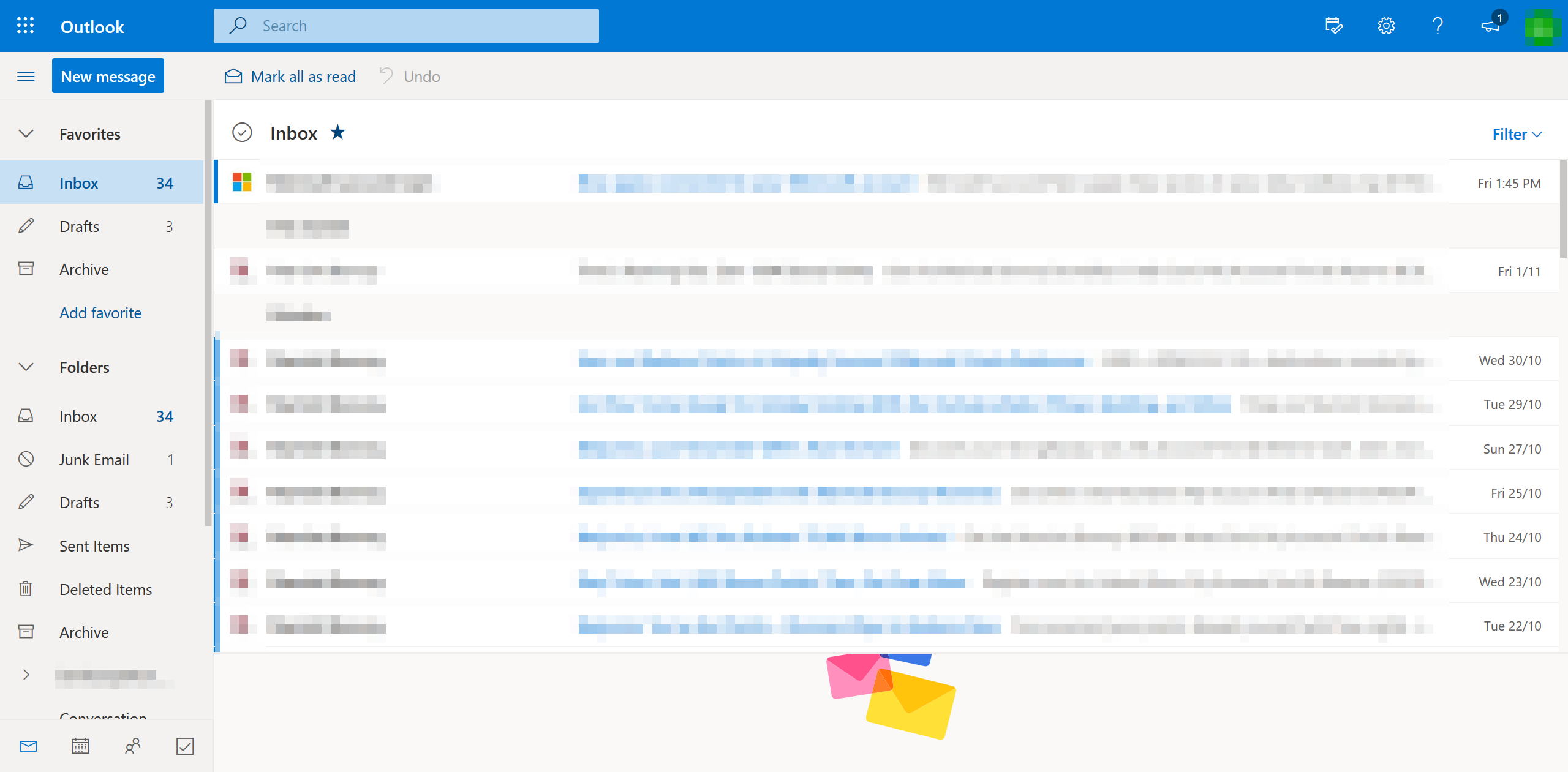
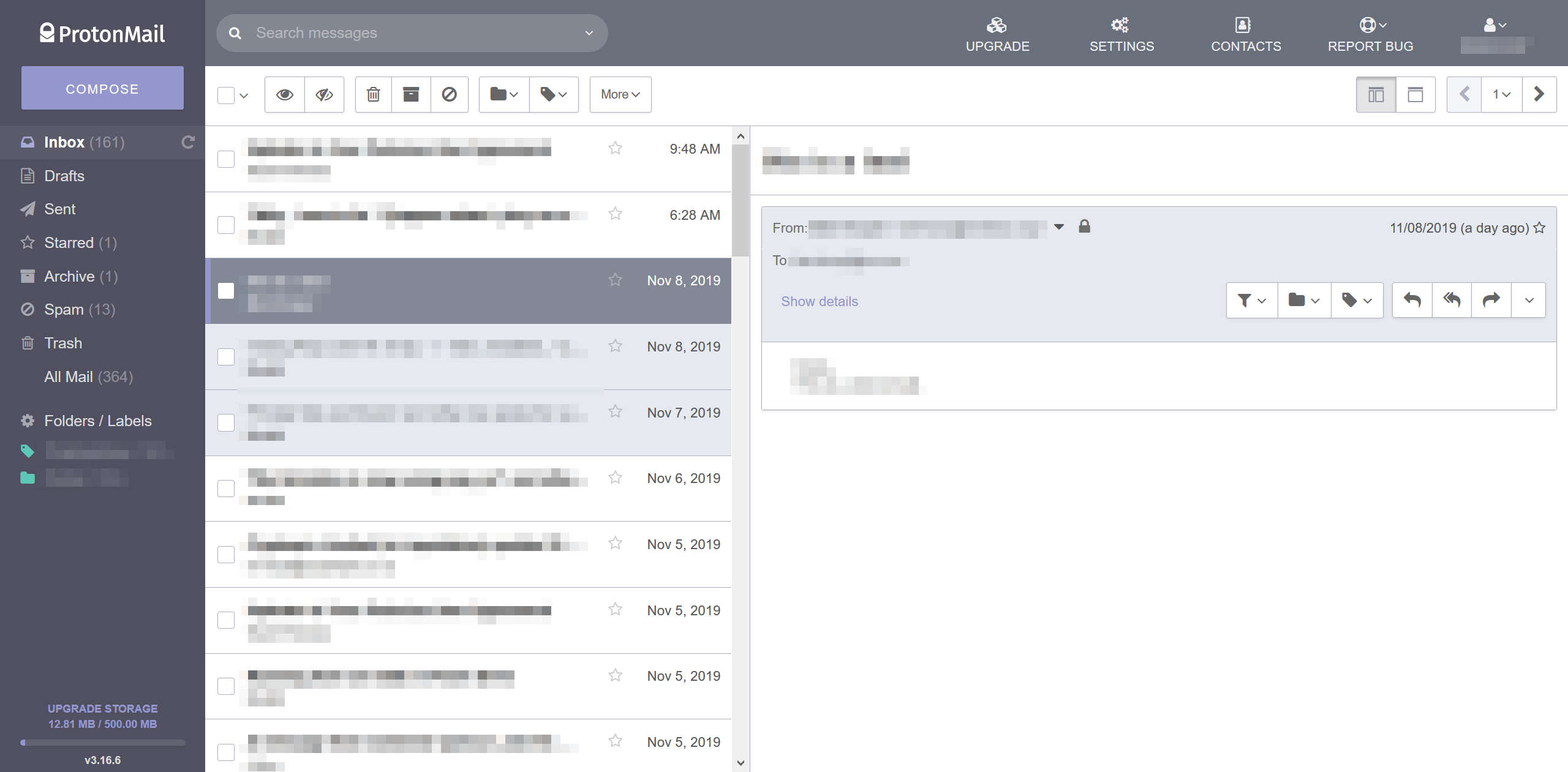
To illustrate my point, i’ve attached here screengrabs from the inboxes of mailbox.org, protonmail, gmail, outlook.com and runbox 7. As you will see, in the competitors inboxes with one glance you can see almost full sender name and subject. In the runbox 7 example you can see the full date, half the senders name and part of the subject. These were taken on 14" laptop with screen res of 2560x1440, windows scaling at 175%. So here, without a layout change, an extended font like Avenir only increases the problem.
Our overarching goal is to provide a fast, user-friendly, legible, and aesthetically pleasing interface while also expressing our profile in a unique way.
The current Runbox 7 UI font face is Avenir Next, published in 2004 as a redesign of the original Avenir font face to provide “typographical flexibility and optimal legibility”.
We chose it in part because of its legibility and as an alternative to Verdana Pro Light, which is used extensively in Runbox 6. Another font face we considered was Univers Next, but it was considered potentially problematic in smaller font sizes and smaller screens in part due to its default kerning.
Avenir Next does consume more horizontal space due to its roundness and legibility, and we are open to alternatives and custom theming as you have also suggested.
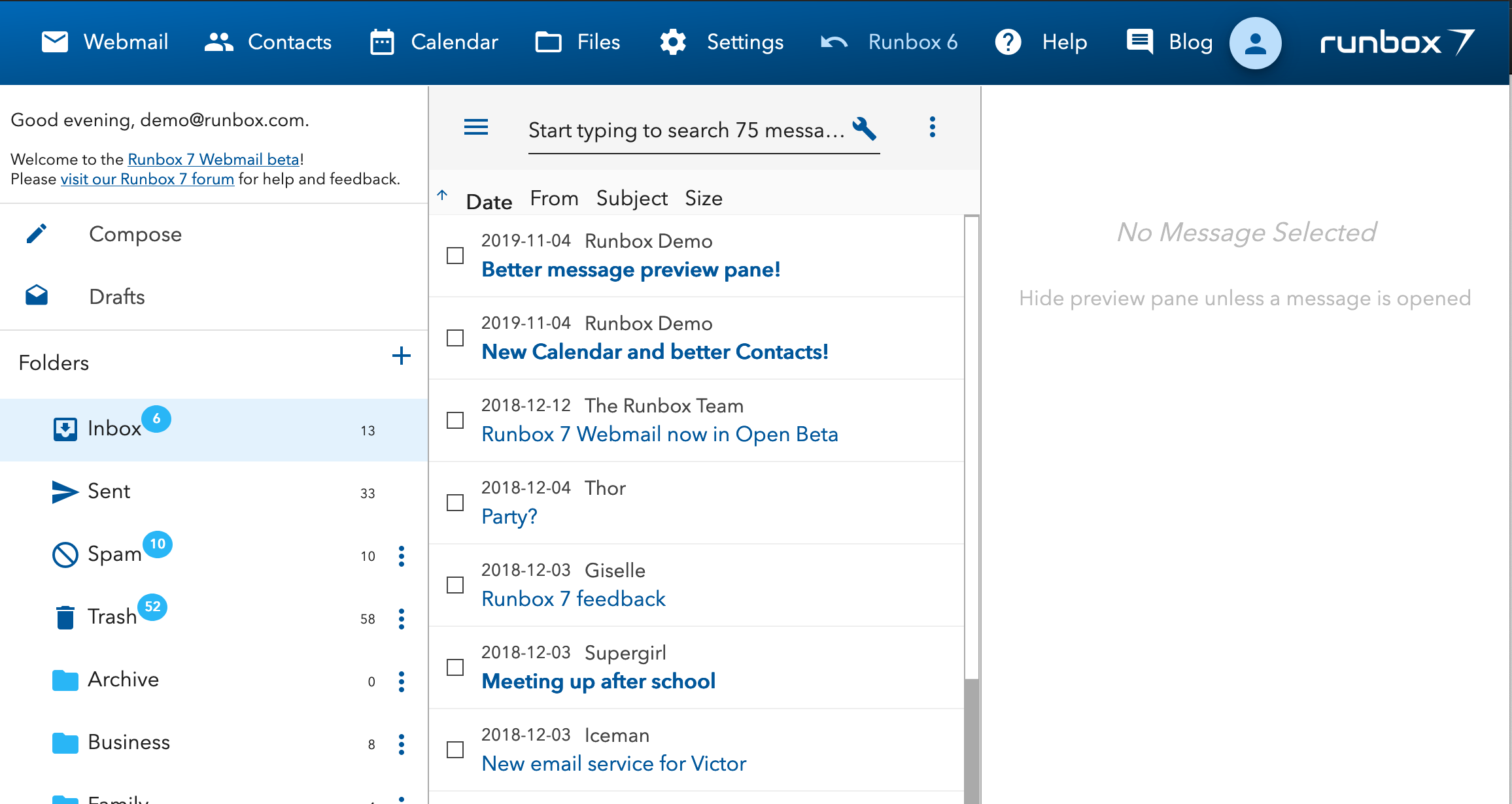
The screenshots you posted show Runbox 7 in vertical preview mode without message list wrapping, and that’s part of the reason some of the fields are truncated.
If you move the preview pane separator slightly to the left then each entry in the message list should wrap onto two lines, allowing you to see more of each field (see that attached screenshot for an example).
We look forward to continuing this discussion and make Runbox 7 even more excellent!
A loosely related one: when rendering on a slow (or medium fast ) connection, the text first renders as a serif font, only later (after a font gets downloaded?) in its final shapes. To prevent the big visual difference, set fonts to serif as a fall-back, the downloaded font should take over once downloaded.
This post shows well what gets displayed under the above conditions: Ubuntu Palemoon Browser

 ) connection, the text first renders as a serif font, only later (after a font gets downloaded?) in its final shapes. To prevent the big visual difference, set fonts to serif as a fall-back, the downloaded font should take over once downloaded.