Hi guys,
I must say, I am really impressed with the new Runbox 7 interface. Very, very slick! I think you have a fantastic product here.
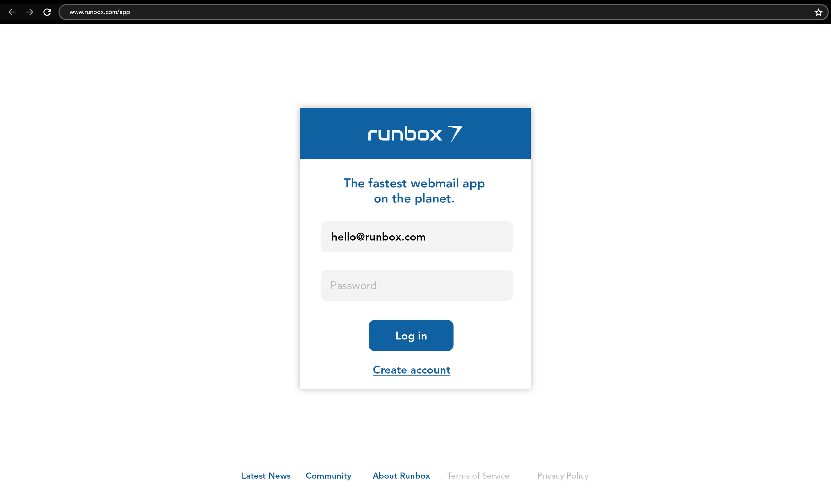
But, I was disappointed to see that you have added the blue header + footer and repeated arrow icons to the runbox,com/app sign in page.
I’m not a fan of google at all, but if you take a look at the google sign page, it is very simple - white background, logo + password field.
I think if you took this page back to where it was - simple, clean and minimal this would be much more effective and pleasant on the eye.
One of the reasons I use Runbox is your commitment to privacy, so when I am in a public place signing into email, I don’t need a giant ‘runbox 7’ taking up the screen.
Less is more, especially in this case!