Hello. One thing that I found confusing is that the “Toggle folder pane” hamburger button is the type of three-line button that normally indicates a menu. It would be better if it was a left and right arrow such as this

Thanks
Hello. One thing that I found confusing is that the “Toggle folder pane” hamburger button is the type of three-line button that normally indicates a menu. It would be better if it was a left and right arrow such as this
Thanks
Already requested without success, here:
https://community.runbox.com/t/enhancement-request-bad-icon-for-toggle-folder-pane/163
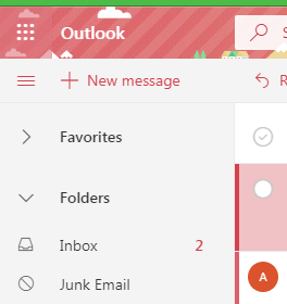
Thanks. I later noticed that the Outlook Web App has the same problem.
It’s not the same menu item as the menu “hamburger” but it is similar yes. The < > icon is already used in the interface to given an option to view the source of an email.
We’ll discuss this further to see what options are available to us.
The “Toggle folder pane” icon should be replaced with left/right arrows or triangles.
The current “burger” icon is not intuitive.
(Firefox ESR 52.6 on Windows 7)
This icon was chosen because it indicates a menu, and the left pane is a menu especially on smaller screens where the main menu is shifted there.
I attempted to merge these two topics so we could keep the conversation in one topic thread, but somehow it seems to have gone wrong and the more recent replies are at the top of the topic. I’ll look in to this again later.