Hello Runbox,
First of all, thanks for the great webmail !
Still… I’m using Runbox for some months now, and everyday I find the read/unread mails icons confusing, for me their meaning is switched up.
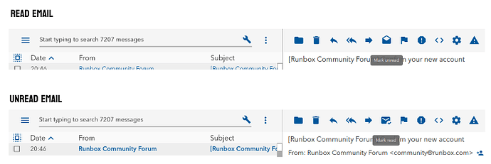
Here’s a screenshot, with some explanations later
Mail is read :
- The icon is showing the current mail status, which is an opened envelope : the button is showing a status, and not an action (this is fhe first source of confusion for me)
- The tooltip is indicating that “pushing button will mark mail as unread”, tooltip and icon doesn’t match.
Mail is unread :
- The icon is showing a closed envelope + a check status, there are two source of confusion here : “unread mail” associated to a closed envelope, “unread mail” associated to a confirmation check
I think that the following would work better (well, in my little brain though) :
- mail is unread : closed envelope
- mail has been read : opened envelope
- the check has no utility here, it can be removed
- the buttons should reflect action, and not status
I saw that it has already been discussed in december 2021, but I still think it could be improved.
The ticket author is saying the same idea :
a button reflects the action that it performed when the button is pressed: if it has an open envelope, the button will mark as read.
Best regards
MrPingouin

