It will be nice to have a Dark Theme.
Regards,
Hello. Themes are something we’ve talked about and little, and we will look in to those once we’ve finished the development of more of the interface for other aspects of the service. Thanks 
I vote for purple!! hahahaha
I second the motion for a dark theme.
Haase
I also vote for a dark theme! =)
I would love a dark theme as well!
Count me in for a dark theme. So much easier on the eyes.
Looks like a dark theme might be a popular choice
I think there’s a bit of a difference between a popular choice, and what should be default. White light from computer and device displays is painful to look at, so a dark theme should be the prototype.
hisses at bright screen
I think it depends what we mean by a “dark theme” here. Many displays automatically dim in darker ambient lighting because this reduces strain on the eyes, and there is also some evidence that the blue component of white light can affect sleep if devices are used in the hours before sleeping. It’s possible this latter situation can be helped by the use of warmer tones and many devices now incorporate features for this.
However, if we mean having light text on a dark background then there is evidence this leads to eye strain. A light background gives out more light and it forces the iris in the eye to close more and this leads to sharper vision. While this can help everyone it is particularly useful for people with a range of eye conditions, and especially those with astigmatism. Doing the opposite with light text on a dark background causes the lighter text to stand out more, but it can also be less focused on the retina which can lead to eye strain.
There is also the argument (which may or may not hold true for any given person and how they use email) that if you are composing something that will most likely be read by someone using a light/white background then it is important that you see it that way too. It wouldn’t be so important for text perhaps, but it would if designing something with colour and/or graphics.
There is obviously a large element of personal choice here, and the background and text don’t have to be black or white, as the contrast between the two could be much less than that.
So, with that said, what are the themes you’ve found are easy to read and not a strain on your eyes?
Hi There Ppl
One more vote for dark and light grey.
Well,
These are few examples of themes to take into consideration, at least most reading apps have these options and now even operating systems, desktop apps, and mobile apps have them.
The following examples are from the Firefox Reader View:
Light Theme:
Sephia:
Dark:
The latter feels just right to me and it matches my operating system theme.
Regards,
Gabriel
Gabriel’s 3rd image, white text on a very dark grey (possibly even black for more contrast) background, is exactly what I was envisioning in my earlier request.
It doesn’t have to be default, but the option would be great.
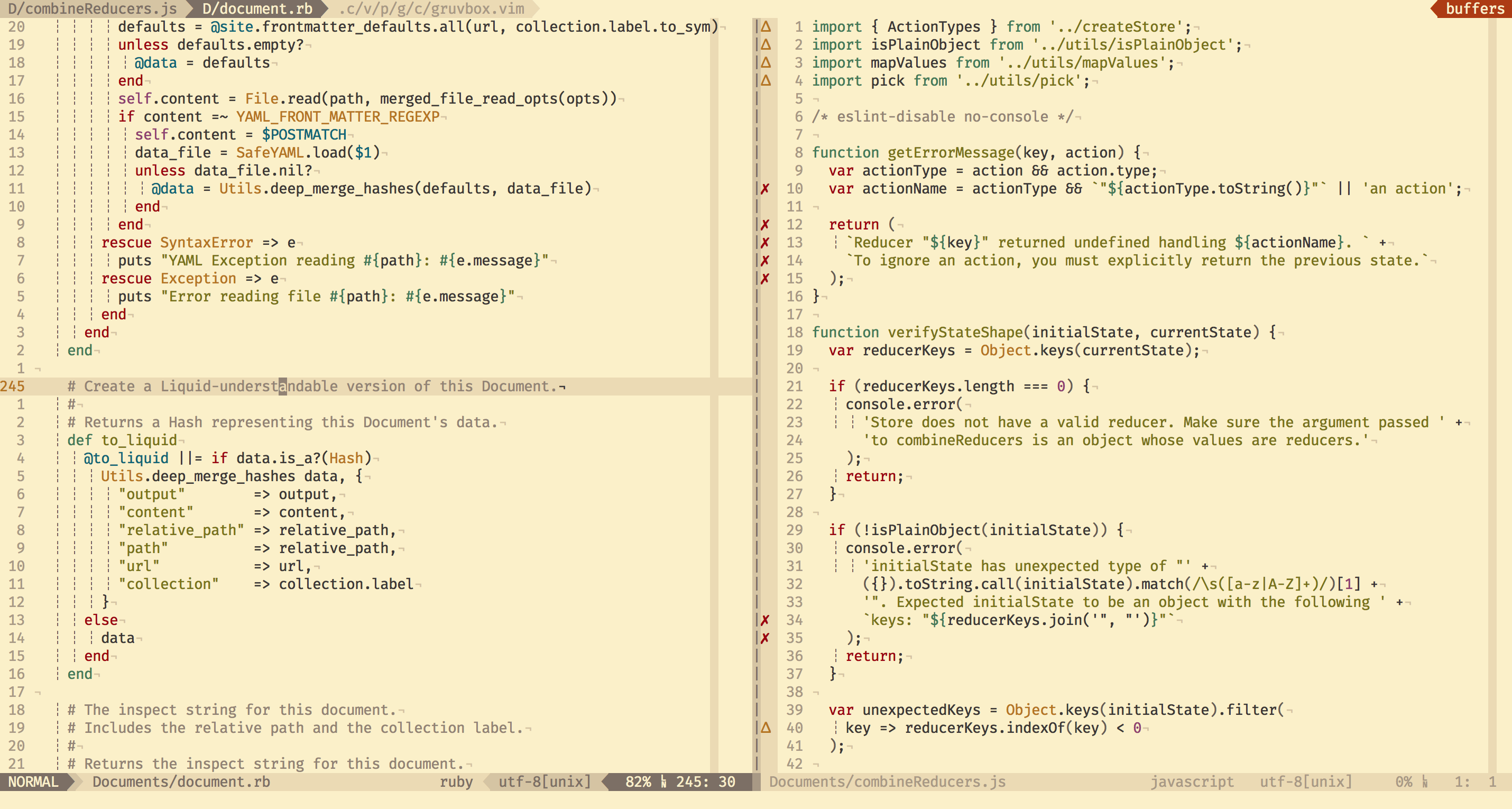
It would be lovely if you could adapt my favourite Vim theme, gruvbox, which provides both dark and light options with hard, medium, or soft contrast (I personally prefer high contrast for dark and medium contrast for light). In the GitHub repo I linked above, you can find the full palette and Vim code, which should make adapting it easier.
Here are a couple of screenshots:
Dark:
Light:
I would like a dark theme as well for viewing e-mails on my tablet at night.
Thanks a million for considering a Dark Theme. I love the new Runbox web interface, but due to light sensitivity I have not yet been able to use it (browser dark theme plug-ins don’t seem to work either). Looking forward to when this feature rolls out.
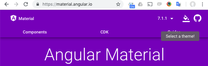
We are using Angular Material which have great support for theme selection - so it’s actually not very difficult to implement with our current setup.
See https://material.angular.io/ for an example of how we are going to implement it (click the theme selection in the top right before the github logo). We will of course have our own colors.
I agree - a dark theme is helpful.
I live in front of a computer screen (writer), so anything that helps ease eye strain is appreciated.
Now you’re talking!!! I love Purple!! However, only as a theme, not a background. I’d be concerned about my eyes more than now, but then after awhile the white gets to me too. I’d definitely test the purple!
Some inspiration here: https://userstyles.org/styles/browse?search_terms=dark+gmail